Disciplines: UX Design + UI Design + Data Analysis
We had a site designed in 2016 which went live in 2018. Fast-forward to 2021, the FatFace website had not been updated with current design trends, or the latest accessibility requirements and overall the site lacked personality and a unique memorable charm. My task was to update the branding—making something different from our competitors while incorporating the latest design trends and improving our accessibility ranking.
Project Chameleon was born!
Why does this need to change?
Feedback from Customers
The website lacks personality and does not feel fun or colourful like the stores. Brand mismatch and not an enjoyable experience.
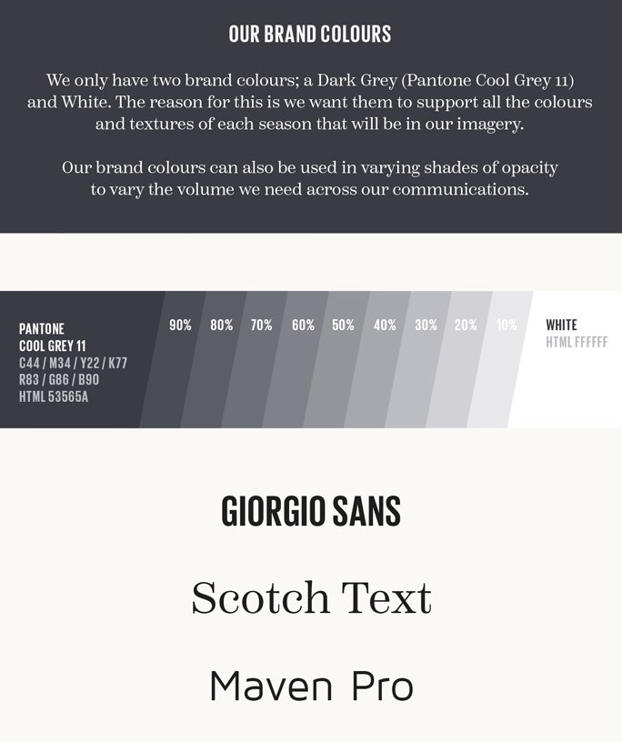
10 Shades of Grey
The site lacks colour and identity. Using shades of grey brings up accessibility issues and customers cannot tell between disabled states and an active state. Shades of grey contradict our green and natural Ethos.
3 Fonts
We have too many fonts! With this increased page-loading speed, we have limitations in font weights and styles and poor rendering when used at a small size.
Hypothesis
Having a cleaner and simpler design language will allow customers to navigate around the site more easily, and help them transact/convert.
Inspiration
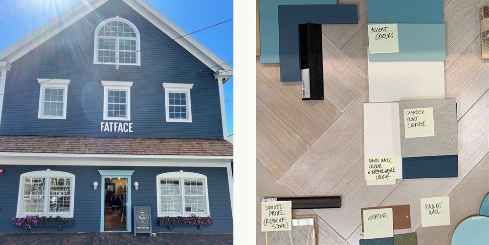
I took inspiration from the new store colour scheme—this allowed us to bring brand alignment across all trading channels.
User Testing
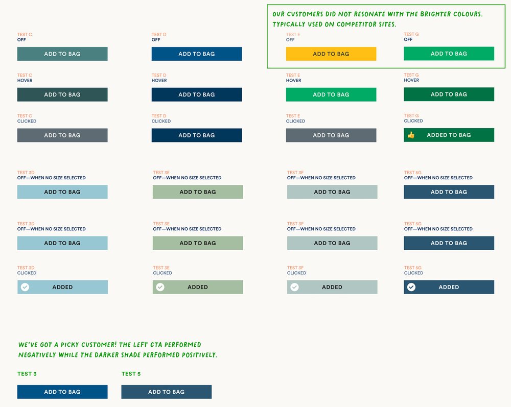
Our customers preferred colours against the latest industry trends and best practices. We had to fine-tune our testing and colour to find the right mix.
We wanted to find a unique look, to give ourselves a clear identity online. Many competitors use green—as we have previously used. We wanted something more unique to FatFace.
Overall the softer washed-out tones resonated with the customer.
During the testing period, we found:
The Navy (Sea Serpent) and Blue (Aquamarine) had a +3.6% increase in the ‘add to bag’ rate in conjunction with the new font and a +4.1% increase in total order revenue on the PDP.
When applied throughout the Checkout process, we’ve seen a +2.5% increase in completing the checkout login page without any further redesign. This page has a high dropout rate. The new colours also lead to an increase of +3.4% in customers completing checkout.
Customers are resonating with the new colour palette as it aids them in their way-finding and clearly calls out the customer’s next step/action to complete their purchase.
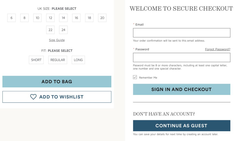
New Colour Palette
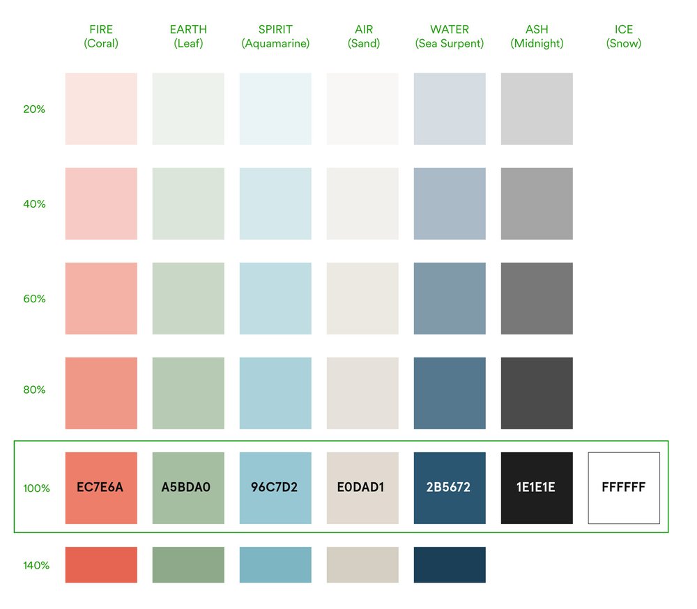
The new colour palette is based on the five natural elements.
The ‘Sea Serpent’ and ‘Aquamarine’ are the core colours being used, but these other key colours are complementary to the scheme.
Off-black text colour to ensure all words are clearly readable.
New Site Font
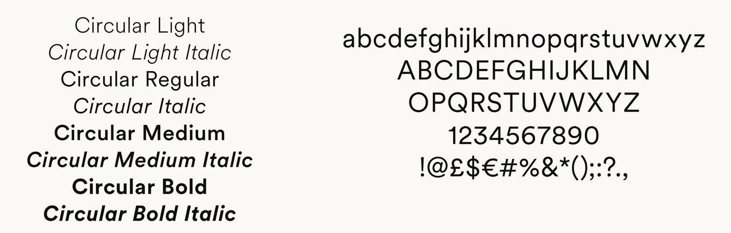
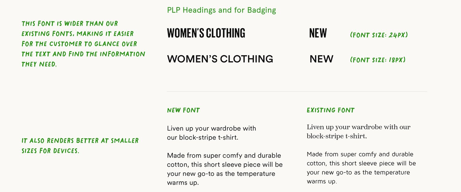
The new sans-serif font Circular was tested and chosen to elevate the on-site usage.
The new font is clearer and helps us achieve our accessibility goals.
We currently use 3 web fonts which is very uncommon as sites have a design system using one serif (i.e. Times New Roman) and one sans serif font (i.e. Helvetica).
Since we have 3 fonts we’re limited to font weights (such as bold, italics) required for editorial content. The content team have resorted to placing text on images which is bad practice to achieve the look they desire.
Customers are resonating with the font as it is clearer, more confident and easier for the customer to read.
Serif fonts render better on digital screens and are easier to read.
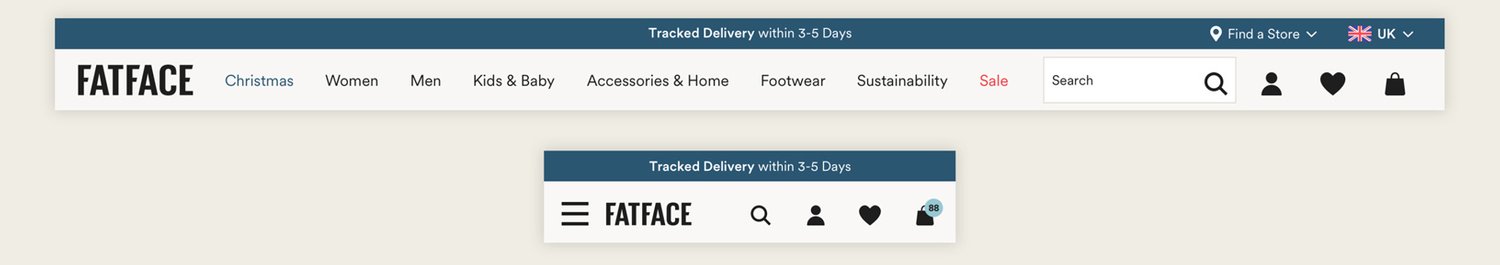
Header Improvements
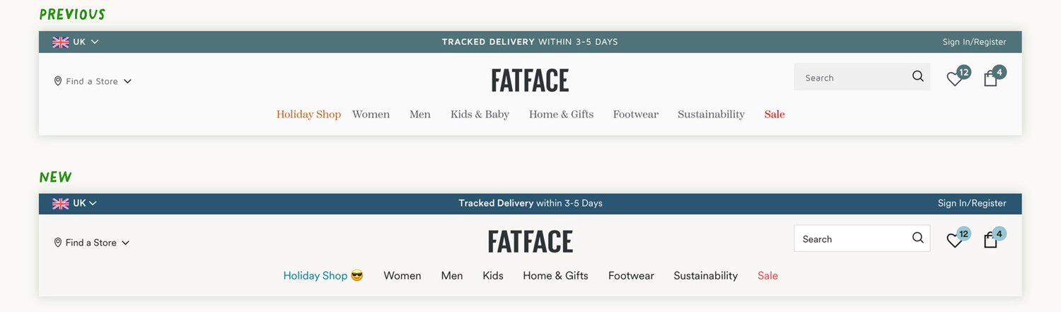
Sand colour is softer and warmer to look at than a grey background.
Clearer navigation titles.
The search field stands out from the background—looking more inviting to enter text into.
[Fast Forward 6 months later]
Our customer is a creature of habit (even the bad habits!). So making small changes rather than a ‘big bang’ allows them to feel familiar with a new layout without being alienated.
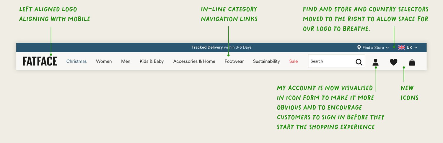
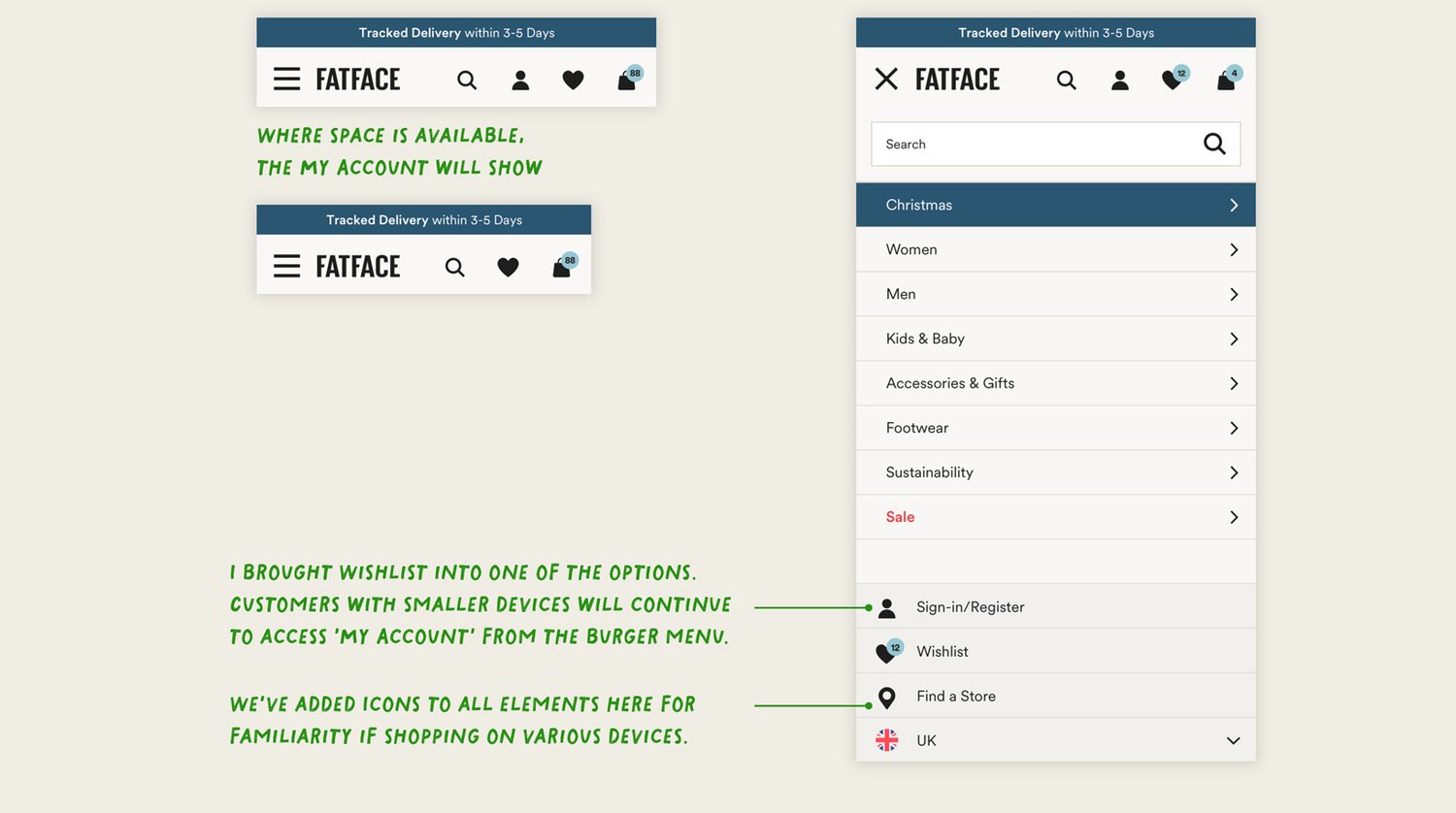
The biggest changes are the shallower in-line header, allowing content to come up further up the page, a consistent logo position and new ‘app-like’ icons solidifying the way-finding experience.
‘My Account’ is now visualised in an icon to encourage customers to sign in and create an account. The customer journey has been to sign in via a drop-down than a separate page to make the experience seamless.
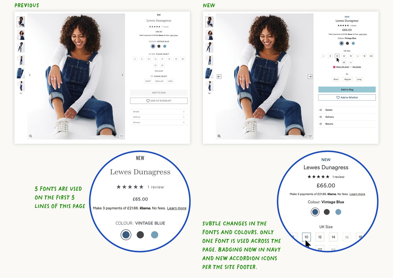
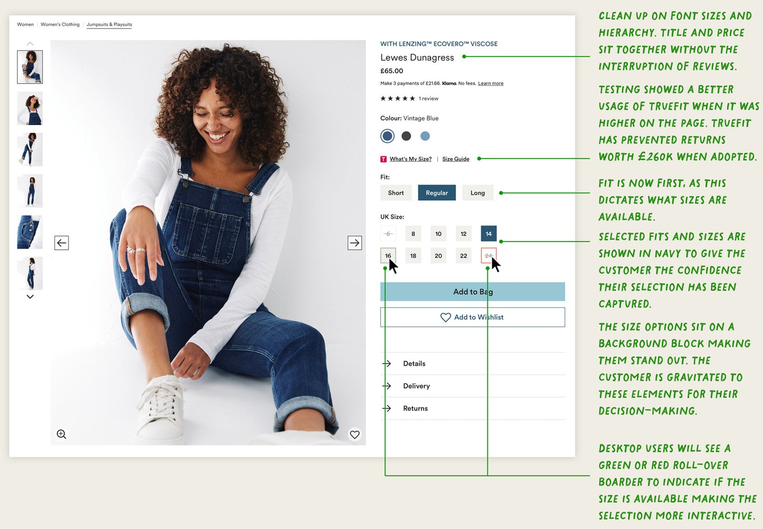
PDP Improvements
[Fast Forward 6 months later]
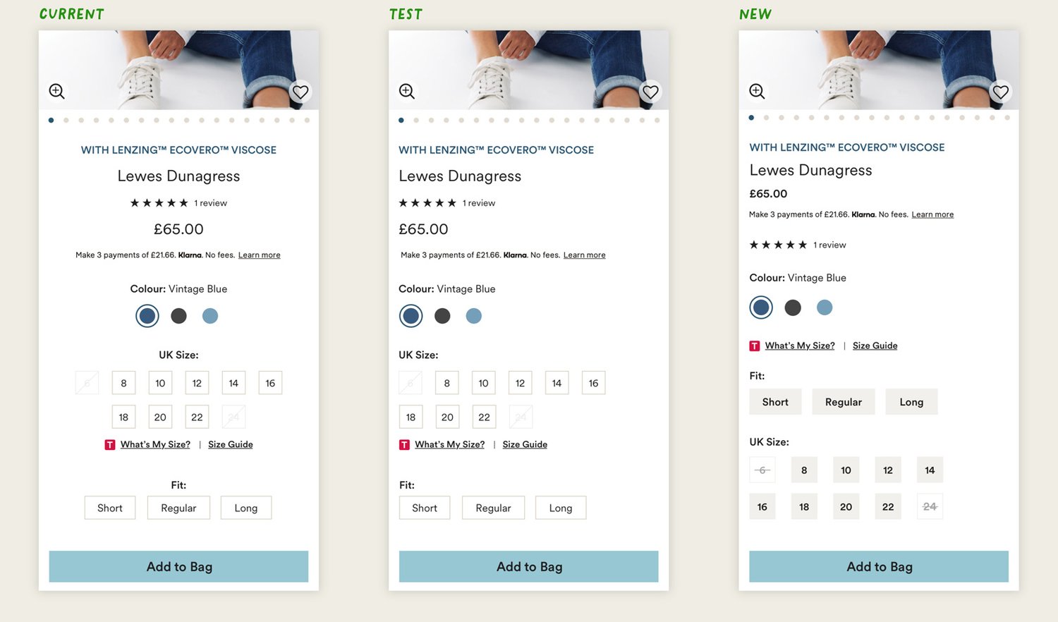
The PDP alignment is now left-aligned.
When we tested this layout order revenue increased by +2.6% and overall conversation increased by +3%.
Left-aligned content delivers a straight left edge. This anchors readers, so they know where the next line will start each time. This increases the speed the customer scans the page to find the information they need or in this case to select the size to purchase.
The hierarchy of the content is adjusted to follow a more logical flow without items breaking up the sequence.
UI Enhancements
PLP Improvements
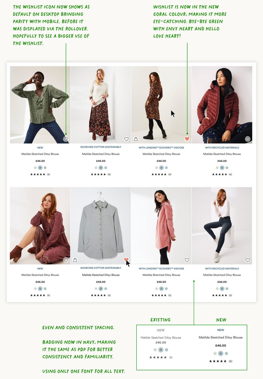
Soft changes to the PLP were made—removing the use of 3 fonts and replacing it with Circular. The use of colour and font weights to break up the hierarchy.
A left-aligned test of the titles, price and colours proved unsuccessful in conversion. This was a learning that we need to be bolder with the changes—not just keeping the same design and changing the alignment—but testing an ideal state and then fine-tuning to get there.
Changing the grid layout and filters was added to the roadmap for future testing and improvements.
© MMXXIV PARCA
